Brush · Web & Mobile

A learning platform that keeps self-motivated artists moving.

Brush is an art and design tutorial platform aimed at the independent, self-motivated creative looking to expand their knowledge and skillsets. The web experience and mobile app give users a place to watch videos and tutorials, follow a community of mentors and professionals, and share and upload their own work for others to learn from.

RoleInteraction, Visual, Brand
DurationAug – Sept 2021
TypeEducation · Web & Mobile
ToolsFigma
Concept
Project Description

Learning, mentorship, and community all in one place.

The power of mentorship and teaching is a powerful tool and we have seen it put to great use in other learning apps available to aspiring creatives. Brush combines that power with the social and community aspect of other video sharing and social media apps to create the ultimate learning experience for users to pursue new skills, network, and grow alongside their peers.

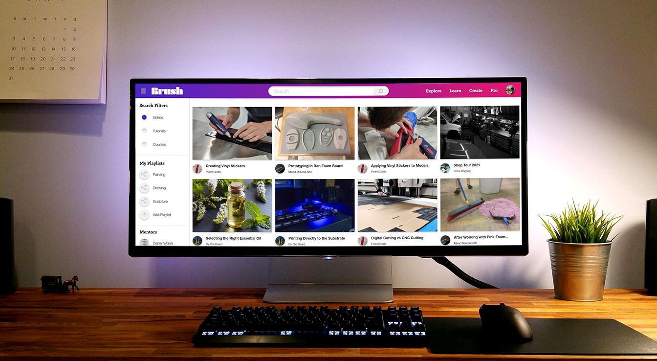
Brush desktop app — Explore page on a monitor in a studio workspace
Goals

Designing for motivation, not just material.

Creating a Framework

A user flow that leaves nothing undefined.

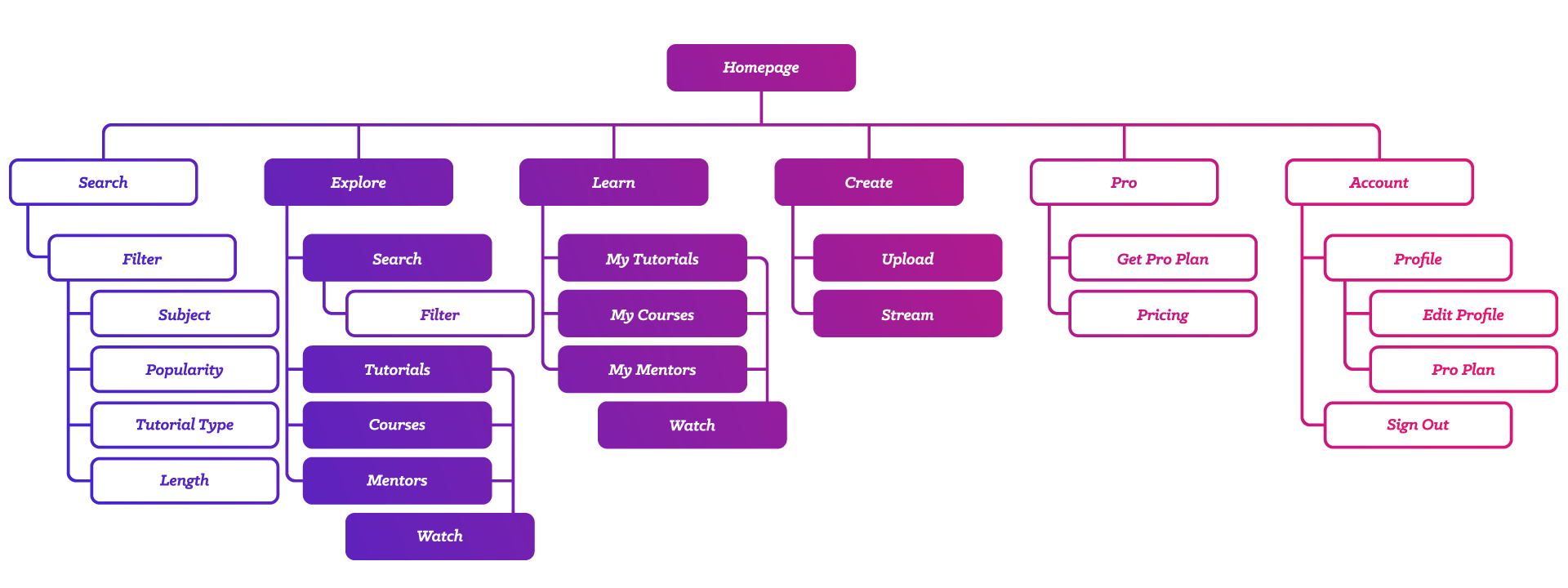
To understand how users would navigate Brush, I first identified a working information architectural layout to better inform the user flow to come. I started by outlining the main functions, then expanded each section to figure out what supplemental features would create a fully functional experience and nothing undefined. This also communicated how to proceed with the layout of each page and reach the end of the user journey.

Brush sitemap — Homepage branching into Search, Explore, Learn, Create, Pro, and Account, each expanded into its sub-pages
Style Guide

Comfortable and inspired, never pressured.

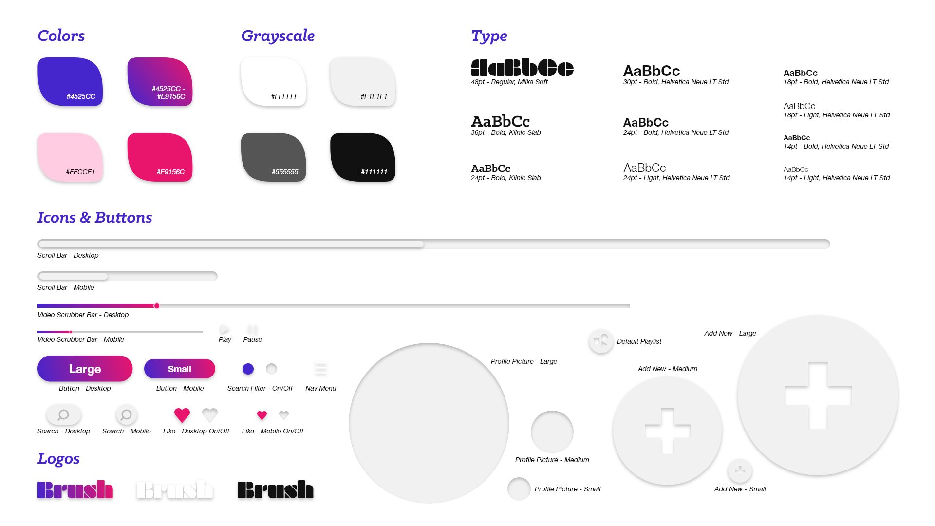
Brush is meant to have a semi-professional feel that sits in the balance between work and play. The user should feel comfortable and inspired but never pressured; the goal is to build on the motivation that brought them to the app in the first place. Through bright and vibrant colors, bold and blunt typefaces, and soft icons, the aim was to create an engaging user experience.

Brush style guide — color palette with hex values, grayscale, type scale, icons and buttons, and the Brush logo in three treatments
Design

From wireframe to interface.

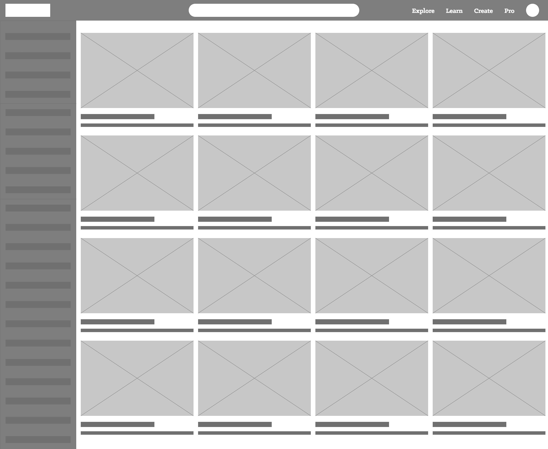
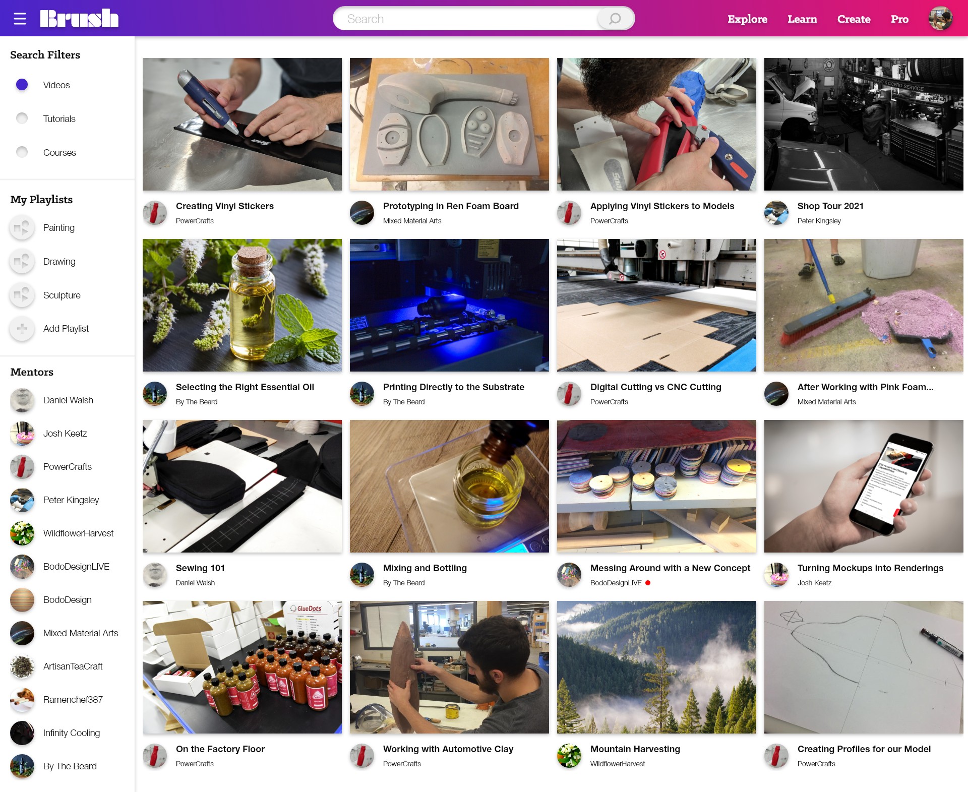
Explore, the homepage, is where every visit begins. This is the starting point and the first place a self-motivated learner meets a feed of videos, tutorials, and mentors built around them. I wireframed it first to settle the structure: a left panel for filters, playlists, and followed mentors, and a main feed catered to each profile. Once the skeleton was there I moved to high fidelity, layering in Brush's color, type, and video library catered to the user.

Explore lo-fi wireframe — sidebar of filters and a grid of video thumbnailsExplore hi-fi — the finished Brush homepage with search, filter sidebar, and a full grid of craft videos
Experience

One continuous learning experience.

Brush is organized around connected pages, each handing off naturally to the next and turning passive watching into active creating and sharing. Explore opens the loop; Learn, Create, and Watch carry it through.

01Learn

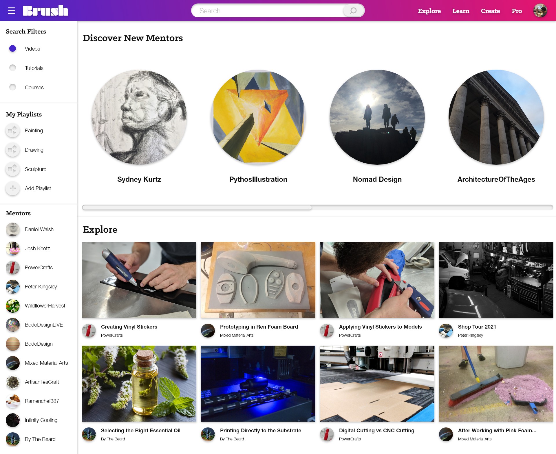
The Learn page is a more focused landing page for users who know what they're looking for. Rather than browsing suggested results and exploring new topics, the user can access their most recently viewed mentor pages and most relevant course materials and tutorials. The same left panel carries over to filter results and feature playlists and mentor pages.

Learn hi-fi — Discover New Mentors carousel above the personalized Explore feed

02Create

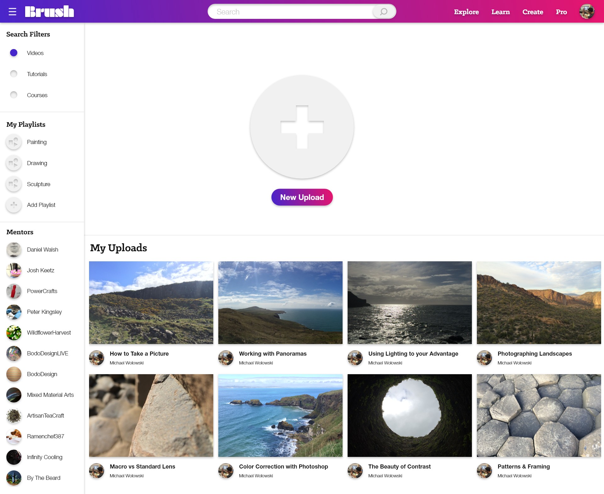
On the Create page, users can upload their own private videos and playlists for required course materials. Mentors can upload videos and tutorials or assemble courses for other users to interact with. The same options are available for filtering your own uploads and accessing playlists and other mentors' content.

Create hi-fi — the New Upload button above a grid of the user's own uploads

03Watch

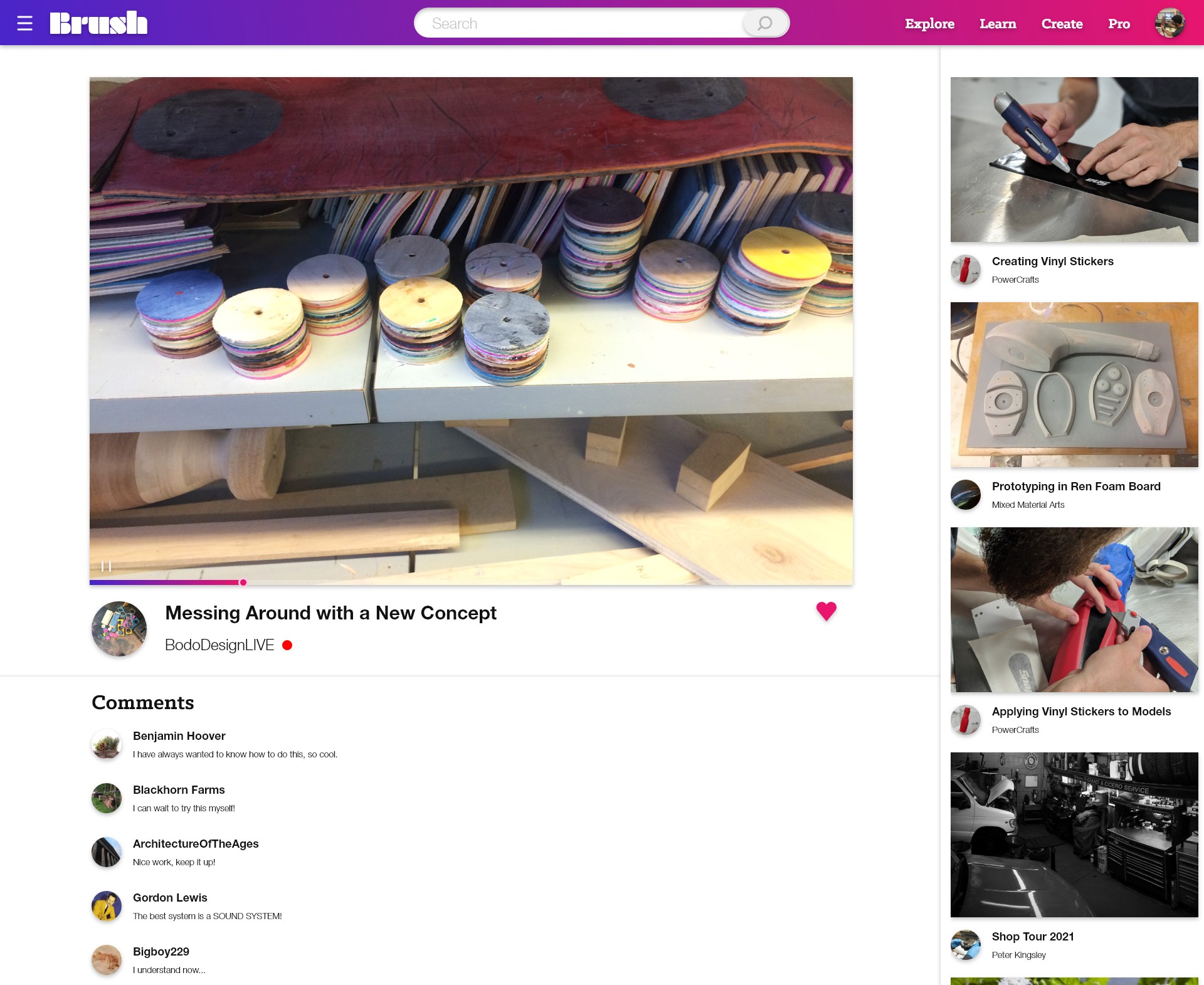
The Watch page is the main destination of the user flow and where users spend most of their time consuming videos, tutorials, course materials, livestreams, and more. Recommended content sits in the right panel. Users can like videos to save for later, comment, interact, and leave feedback for other viewers and mentors to keep the conversation flowing.
Watch hi-fi — a playing video with creator, like control, comments, and a recommended-videos rail
Mobile

Same experience, on the go.

Brush was designed to travel. Each of the surfaces was carried into a mobile layout so learners can explore, create, and watch from anywhere; the same continuous loop condensed into a single thumb-friendly column.

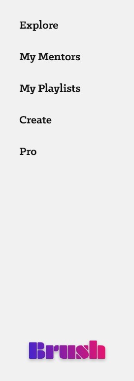
Mobile home — search and a scrolling feed of videos Mobile create — New Upload above the user's own uploads Mobile watch — a playing video with comments and a recommended feed Mobile navigation menu — Explore, My Mentors, My Playlists, Create, Pro
Prototype

Clickable desktop prototype.

A navigable prototype of the Brush desktop app from the homepage to Learn and Create, and finally to the Watch page. Try it out!

Key Takeaways

What the project taught me.

Reflection

Motivating yourself can be a difficult task and even more so under the pressure of following through. Take learning a new language, practicing a new skill, or even starting a new project. Brush was designed to create a user-friendly experience that helps self-motivated individuals stay on track.

While working on this project I faced challenges of my own, and in doing so was reminded of the same difficulties many Brush users will face. That was a primary inspiration for many of the concepts and features of Brush.

User-Centered Design Interaction Design Prototyping Figma

Let's make something worth making.

Have a project or role in mind? I'd love to hear from you.